In my last blog post, I explored the words in Shakespeare’s plays, but my real goal was to make a Shiny app that would allow anybody to find out about any word they were interested in. I’m not going to go into the detail of creating a Shiny app, because I really want to focus on styling. There are loads of tutorials out there for Shiny basics, but less on how to substantially change the look of your app, beyond the stuff bundled into the shiny package. But fear not: there are lots of ways to change it up and get something looking just how you want it.
Once I’d manoeuvred my code into the Shiny format, I had a working app. You can see my code for that part here. And this is what it looks like when you run it:
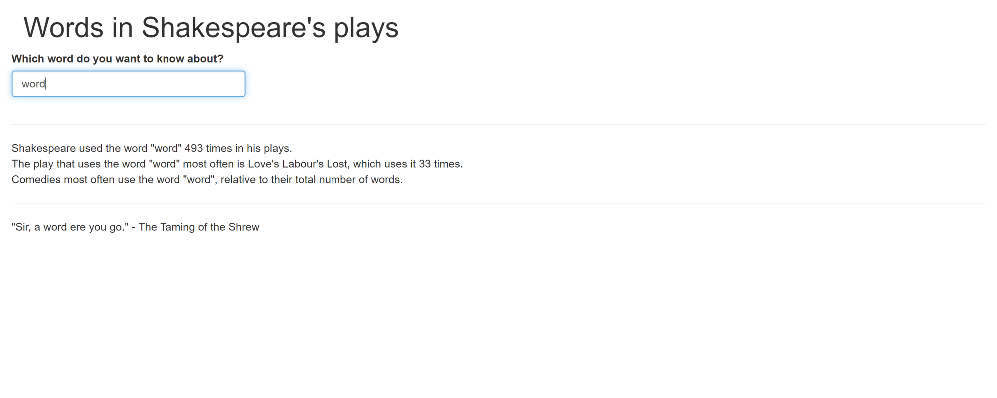
It’s…er…not great. It works. From a data perspective, you can find out what you want. But it’s super plain and not very engaging. That matters, because as data scientists, part of our job is communicating data in a way that’s compelling and comprehensible. Often when we talk about data visualisation, we mean how to plot something, but on a way more basic level, there are ways to present data that are more likely to grab people’s interest and highlight what’s important.
I’m not going to pretend that in the end I create the most breathtakingly beautiful app! However, it’s a big improvement on what we start with here and uses a number of techniques and tools to get there. This post will cover:
- Styling within Shiny
- Creating a CSS file
- HTML for extra tweaks
Styling within Shiny
To deal with some of the simplest styling, there are arguments you can use within the code for your Shiny app itself. The changes I made are all in the UI.R file, and you can see the full code here.
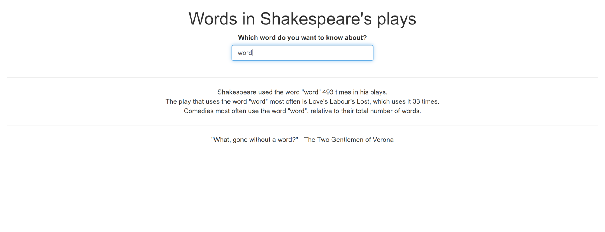
The main thing I wanted to do was change the alignment so all the text was centred. In the header, this is just a case of adding the argument align = "center" to the headerPanel().
With the outputs, things are a tiny bit more complicated. To change the alignment you have put the output into a column(), and then include the align = "center"argument. Because it’s a column, you also have to set the width argument. The standard width of a Shiny app is 12, so if you wanted two columns, for example, you could set the width of each to 6. In this case, however, I just wanted everything in one column, so I set the width as 12, and wrapping it in a fluidRow() for good measure to improve the flow of the page.
# Example of one of the rows in the app

fluidRow(
    column(12, align = "center",
                  textInput("focus_word",
                            "Which word do you want to know about?")
    )
  )
Making these changes across the file results in a neater app with barely any effort.
Creating a CSS file
OK, OK, that’s better, but the app is still pretty plain. What if you want a bit of personality? Some colour, some different fonts? That’s totally possible, but we’re going to have to get into CSS. In this example, I’m going to add a style sheet. You can see the code for this version here.
Getting started
First, I created a folder called www in my app directory, and then created a file called shake-style.css. This would be where I would add the styling later.
I also needed to tell my app that there was a style sheet to refer to, so in the UI.R file, I added the line theme = "shake_style.css". You don’t have to do this at the start, but it’s easy to forget!
Changing colours
If you haven’t used CSS before, then the critical thing to learn is working out how to refer to the element you want to change. You do this in your web browser. Here, we’ll be opening the Shiny app in the browser, but you can do this on other websites too.
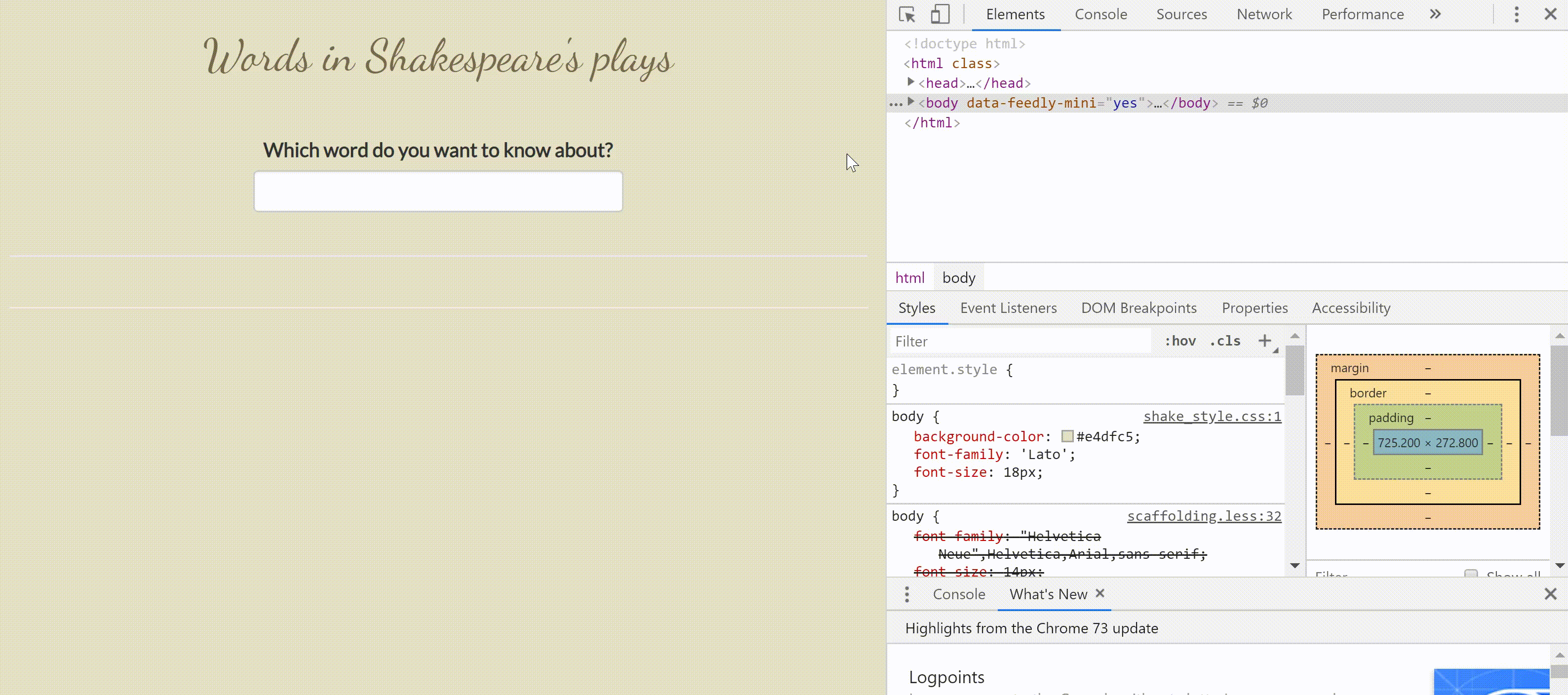
For example, I wanted to change the background colour. With the app open in my browser, I hit the shortcut CTRL+shift+I. This opened up all kinds of information about the page, including the CSS that was being used. You can also navigate to the same place using your browser options (for example in Chrome, I would go to More Tools -> Developer Tools), or you can right click and select ‘Inspect’ on the bit you want to look at. There are slight differences on different systems and browsers, but essentially you want to be at the Inspect Element area.
Once here, I needed to explore to find the element that needed changing. Some of the time, it will be pretty obvious - in this example, I am looking for the background colour, which is defined pretty early on in the body, but it can be a bit more obscure. However, if you click on an element in the inspection pane, the part of the page it is referencing gets higlighted. For colours, it is easy to know if you are looking at the right element or not because in the Styles pane, it shows a preview of the defined colour in a box - and you can change this and see the difference on the actual page. Don’t worry, this isn’t permanent! But as well as allowing you to see what different colours will look like, you can make sure you are actually changing the bit you think you are.
In my new, empty .css file, I added the information I needed copied right from my inspections, with the colour I wanted defined.
body {
  background-color: #e4dfc5;
}
Using different fonts
In just the same way, you can identify how to reference the text that you want to change. There will be a way to change the font for the whole app, as well as ways to individually tailor specific elements - it’s just a matter of exploring to find the bit you want to change.
First, however, I decided which fonts I wanted to use. I was interested in some Google Fonts, so I had to add an extra bit of code into my UI.R to ensure they would be properly identified by Shiny, as when I included this code in the .css file, it wasn’t picked up.
  tags$head(
    tags$style(HTML("
                    @import url('//fonts.googleapis.com/css?family=Dancing%20Script');
                    @import url('//fonts.googleapis.com/css?family=Charm');
                    @import url('//fonts.googleapis.com/css?family=Lato');

                    "))
    )
You can use this code for any Google Font you want, and just change the family to the one you need.
This still needs to be referenced in the .css file, though. For example, I want the font family of most of my app to be Lato, so I add this to the body, and update the size while I’m there.
body {
  background-color: #e4dfc5;
  font-family: 'Lato';
  font-size: 18px;
}
I could also change the font-weight or color if I wanted, which I do for some of the elements.
Making changes in different app states
There was one more thing I wanted to change using the .css file. At the moment, if a user clicked on the text input cell, it is outlined in blue with a shadow. The colour doesn’t work with the rest of the scheme, so I wanted to change that.
When I first tried to inspect the page to find the right element to amend, it wasn’t obvious where the highlighting shadow was. The reason for this is because the highlight isn’t part of the natural resting state of the app - it only appears when the user is interacting by clicking in the text box. I needed to set the state of the element to “focus”, which then revealed slightly different things to amend. Like with choosing the colour above, I could change the colour in the inspection pane to find one that suited my scheme better.
You can see the steps I took in this gif, which might make it a bit clearer how you might explore the inspection pane!
This left me with the code below to add to my .css file. See how the element includes “:focus” after the element name?
.form-control:focus {
border-color: #f5f5f5;
box-shadow: inset 0 1px 1px rgba(0,0,0,.075), 0 0 8px #8a6d3b;
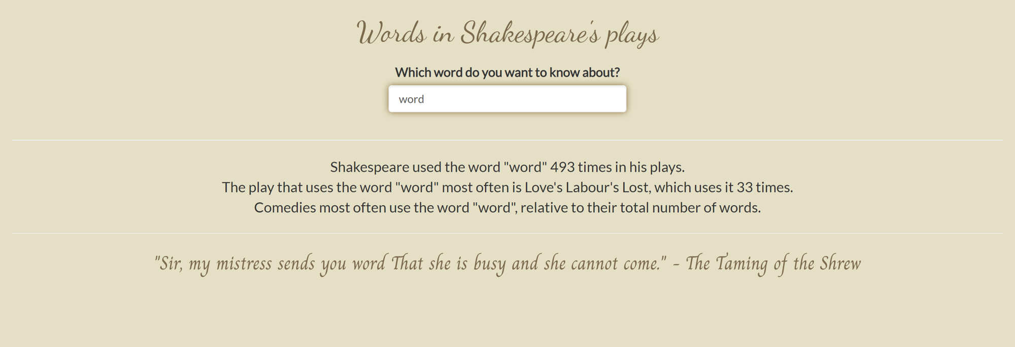
}Overall, my changes make quite a big difference to the look of the app.
HTML for extra tweaks
I’ve done most of the legwork now, but it’s time to consider how to help the user find what they need. Everything in this app is presented as text rather than plots, but there are still ways to highlight the findings. Really obviously, I can change things like the font, size or weight of bits that need to stand out. For this, you need to use HTML, and make some changes to the existing app to allow for this. These are the final styling changes I made so you can see the full code in my final version on github, here.
Specifying an HTML output
At the moment, all my outputs use textOutput and renderText, but that only works for straightforward text in Shiny. If you want to start adding HTML, you need to use htmlOutput and renderUI. You also need to wrap the text part in HTML(), so that when you add some HTML to your text, the app knows it is there.
That means, for example, that I now have htmlOutput("word_total") in my UI.R file and the following (slightly simplified) in my server.R file:
  output$word_total <- renderUI({
    HTML(paste0("Shakespeare used the word \"",
                input$focus_word, "\" ",
                prettyNum(shake_words[word %in% focus_word(), .N],
                          big.mark = ","),
           ifelse(shake_words[word %in% focus_word(), .N] == 1,
                  " time", " times"),
           " in his plays.")
    )
  })
Adding HTML
At this point, you can add HTML tags, such as <b>bold text here</b> or <br> to get a line break. You can also make some changes to the font features, such as <font size = 5>different size font here</font>.
But you can also go back to your .css file to add in some definitions! For example, I wanted to have a tag for a certain font family, so I added the below to the .css file. The hashtag defines the ID name of this definition, which is followed by what will be used to call it.
   #mydiv f {
     font-family:"Charm";
   }
So my code for the word_total output looks like this:
  output$word_total <- renderUI({
    HTML(paste0("<div id='mydiv'>", "Shakespeare used the word \"",
                input$focus_word, "\" ",
                "<f><font size = 5><b>",
                prettyNum(shake_words[word %in% focus_word(), .N],
                          big.mark = ","),
                "</f></font></b>",
                ifelse(shake_words[word %in% focus_word(), .N] == 1,
                       " time", " times") ,
                " in his plays.", "</div>")
    )
  })
The final app
After all those different types of styling, I finished with an app that looks like this:
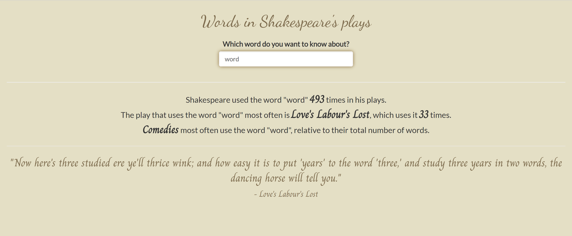
I’ve achieve what I wanted: an app that looks more interesting and engaging, with the key information immediately clear to the user.
Thanks for reading this post - please do have a look at the app here and see what you can find out!