Conferences and meetups have been important throughout my data science career - especially when I was starting out and learning so much, but still critical as ways of keeping on top of new developments and making new connections. It’s been a big change having these in-person events stop throughout lockdown. I was particularly sad to hear that the in-person elements of useR!2020, which I was going to attend as a diversity scholar, were necessarily cancelled.
Yet it’s also been impressive how much has remained, moving online. In the past couple of months, I’ve attended the 2020 Women in Data Science London conference and the N8 CIR ReproHack. Women Driven Development held a remote hackathon focused on products to support people impacted by corovanvirus. And I regularly receive alerts of online sessions going ahead from groups I’ve attended in the past.
I’ve also been involved in this new wave of online-only sessions. I’m currently in the middle of delivering some introductory sessions on R for members of the AI Club for Gender Minorities; next week I’ll be talking about my great love for data.table. My most recent session was on ggplot2, the widely-used package for data visualisation in R, which made me realise I haven’t posted much about it before. So to remedy that, here’s a blog post version of the training, split into two. Today I’ll be focusing on getting a basic plot out the door, and next time I’ll look at themes and making it look pretty.
I’m using a dataset from this great selection; it’s the results of measurements of hawks. I’ll start off by reading in the data and giving it a bit of a clean to make some of the naming clearer and removing a few rows with missing data.
library(ggplot2)
library(data.table)

hawks <- fread('https://vincentarelbundock.github.io/Rdatasets/csv/Stat2Data/Hawks.csv',
               select = c('Species', 'Age', 'Sex', 'Wing', 'Weight', 'Tail', 'Year'))

# Remove some rows with missing weight or wing data
hawks <- hawks[!is.na(Weight) & !is.na(Wing)]

# Label unknown values for sex and age
hawks[Sex == "", Sex := "Unknown"]
hawks[Age == "", Age := "Unknown"]

# Label hawk species
hawks[Species == "RT", Species := "Red-tailed"]
hawks[Species == "SS", Species := "Sharp-shinned"]
hawks[Species == "CH", Species := "Cooper's"]

# Show the first 5 rows of the dataset
hawks[1:5]
##          Species Age     Sex Wing Weight Tail Year
## 1:    Red-tailed   I Unknown  385    920  219 1992
## 2:    Red-tailed   I Unknown  376    930  221 1992
## 3:    Red-tailed   I Unknown  381    990  235 1992
## 4:      Cooper's   I       F  265    470  220 1992
## 5: Sharp-shinned   I       F  205    170  157 1992
There are a few simple things to know to get started working with ggplot2.
All plots produced with
ggplot2use the functionggplot()to start with.Additional layers are added or edited with new lines of code that are added using the
+symbol.For the most basic graph, you will need to provide the dataset in the
dataargument, the features you want plotted (at least for the x axis, and sometimes for the y depending on the type of graph) in themappingargument wrapped inaes(), and the graph type as an additional line as ageom_*()function.
Let’s look at that in practice with a bar chart. Say we just want to know how many hawks of each species are in the dataset.
ggplot(data = hawks, mapping = aes(x = Species)) +
  geom_bar()
You’ve got the ggplot() function with your data defined, as well as the aesthetic you want to map - species along the x axis. You don’t have to map anything to the y axis because the default for geom_bar() is to perform a count function and display the number of cases in the given category. Without that, you would have to do some work creating a separate dataframe with a count variable, so this is pretty handy.
It’s also worth noting that you can put the mapping (and indeed the data) in the geom_*() function too. See how it looks exactly the same if I write the code like that in this instance:
ggplot(data = hawks) +
  geom_bar(mapping = aes(x = Species))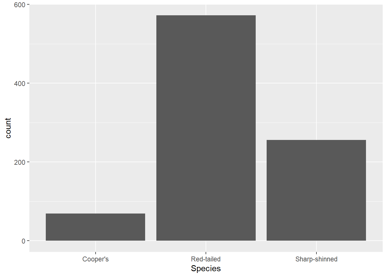
The difference is that the mapping and data in the ggplot() function is applied to all geom layers, whereas if they are defined in the geom_*() function, they are relevant to that layer specifically. That sometimes matters if you are layering two plots on top of each other (which you can do - ggplot objects are just made up of layers). However, much of the time if you have one geom layer, it doesn’t matter. It is worth knowing about as you’ll see both versions used.
Now imagine we want to know a bit more about these hawks - just how many there are is not enough. We can add other features to the aesthetic mappings. Let’s add in the Age variable as a colour feature (note that A means adult and I means immature). That is just a case of adding the fill argument within the aes() function.
ggplot(data = hawks, mapping = aes(x = Species, fill = Age)) +
  geom_bar()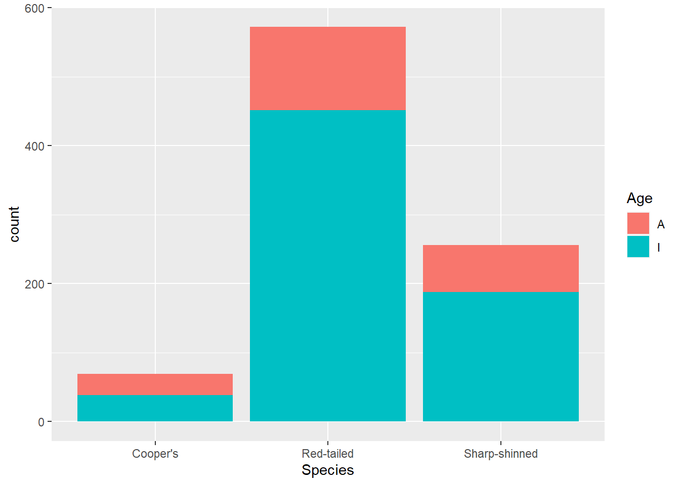
If we want to compare the age breakdown across species, it might be more useful to look at proportions. For that, you can change the position argument in geom_bar().
ggplot(data = hawks, mapping = aes(x = Species, fill = Age)) +
  geom_bar(position = "fill")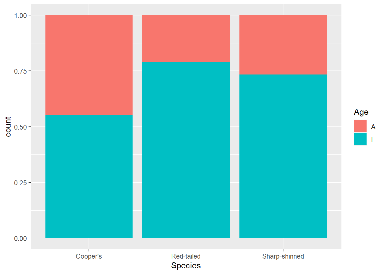
This makes it clearer that more adult Cooper’s hawks were identified than within other species.
Another look you might want is to have the bars next to each other rather than stacked. For that use position = "dodge".
ggplot(data = hawks, mapping = aes(x = Species, fill = Age)) +
  geom_bar(position = "dodge")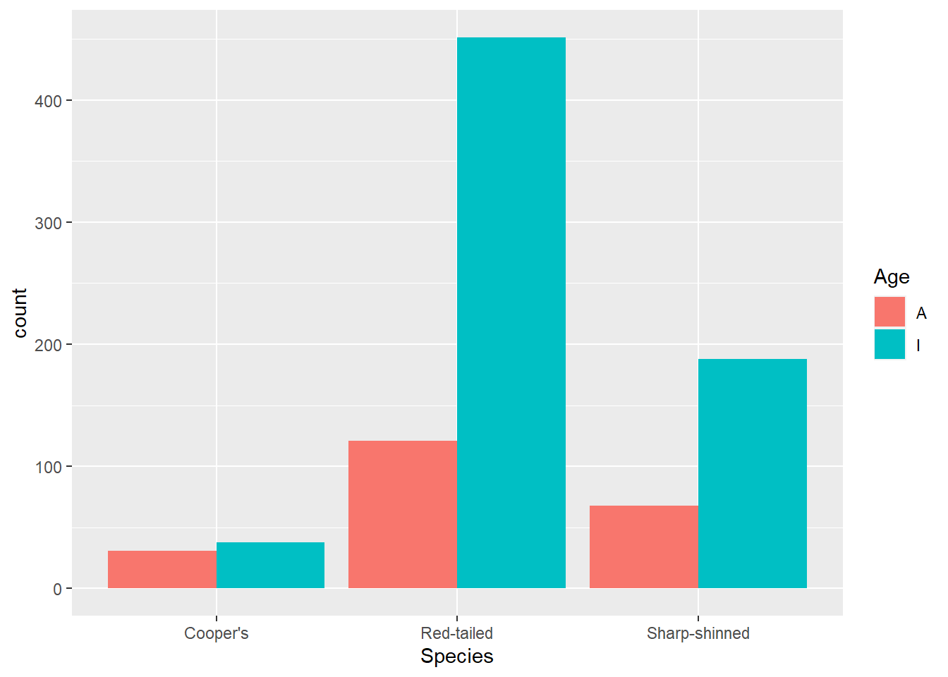
But there are other aesthetics you can change too. Let’s explore some more with a scatterplot. Because we are changing the type of graph, we have a different geom_*() function: geom_point(). Here we use that to look at tail and wing measurements. Note that now we have a y aesthetic mapped.
ggplot(data = hawks, mapping = aes(x = Wing, y = Tail)) +
  geom_point()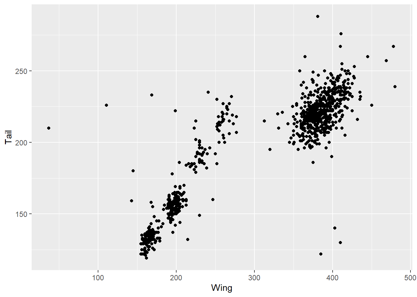
This is already useful for understanding the data. There is obviously a correlation between wing and tail measurements, but there also seem to be some clusters here. Suspecting there might be differences by species, we can add that into the colour argument. Note that we use colour for dots and line, whereas fill fills in an object like a bar. If we used colour with geom_bar() it would colour in the outlines of the bars.
ggplot(data = hawks, mapping = aes(x = Wing, y = Tail, colour = Species)) +
  geom_point()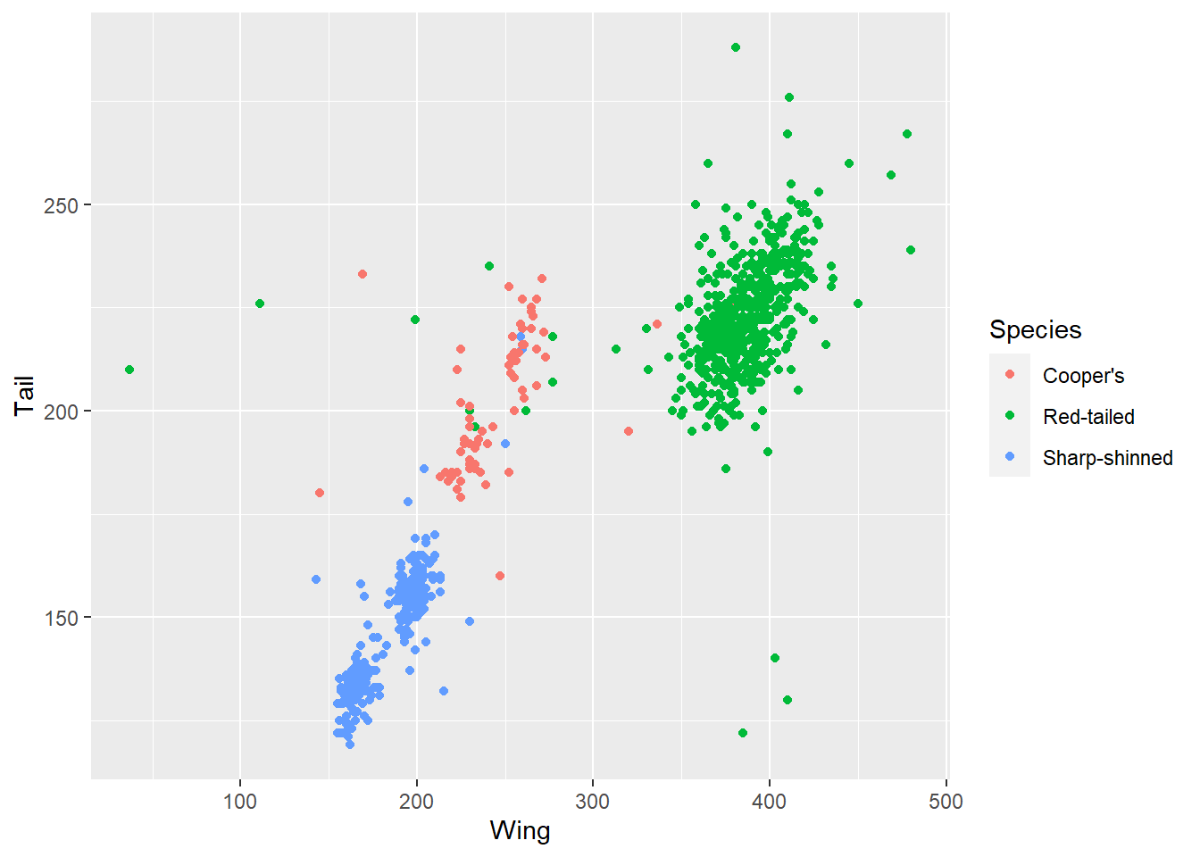
This allows us to see that the clusters in the data are likely due to the different species included, with the red-tailed species generally on the bigger side of hawks.
Other aesthetics you map include shape of the point (shape), size (size) and transparancy (alpha). Here’s an example with Weight added via transparency.
ggplot(data = hawks, mapping = aes(x = Wing, y = Tail, alpha = Weight)) +
  geom_point()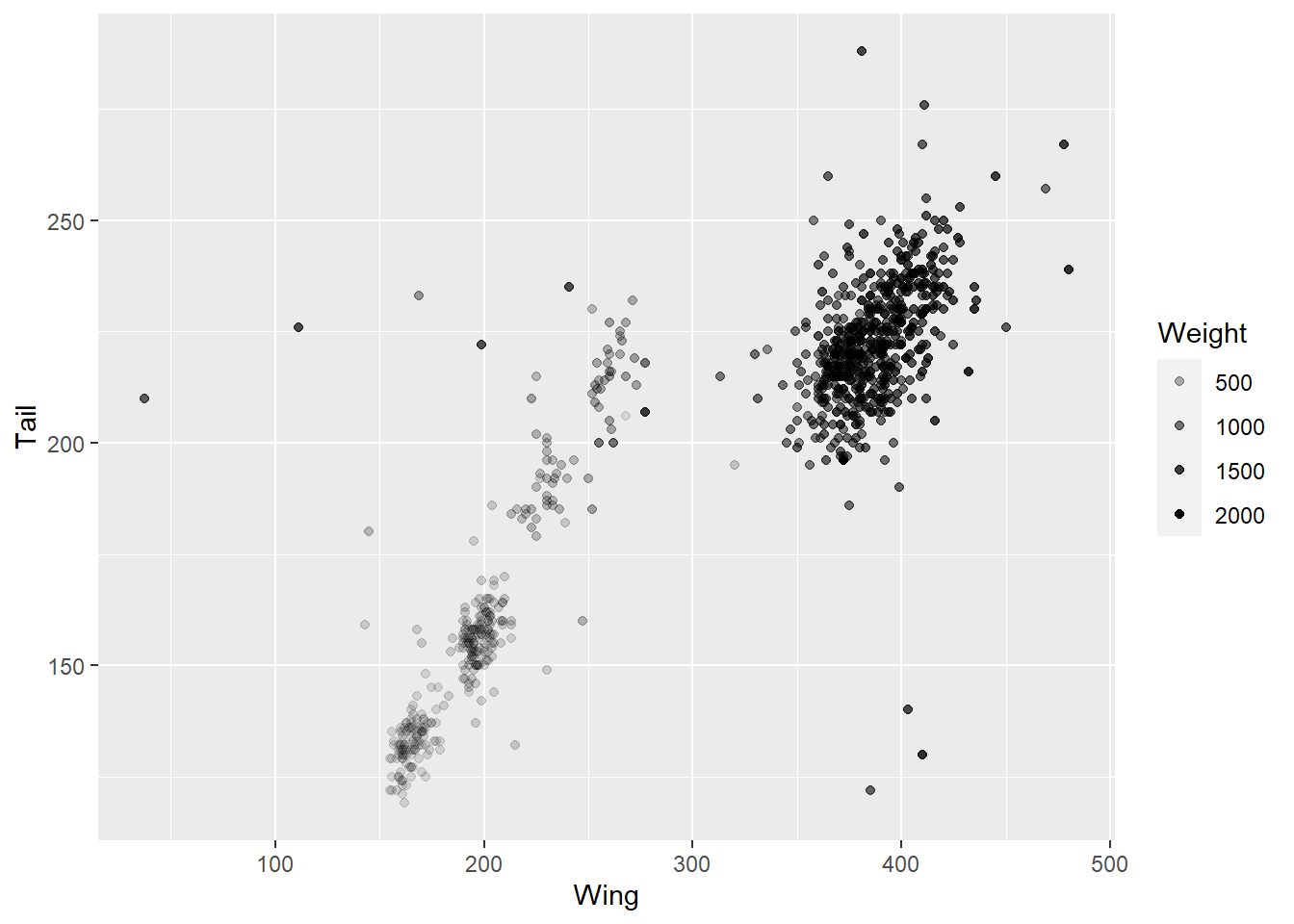
Note that we are using a continuous variable here - it wouldn’t make sense to assign transparency or size to a categorical variable, although you can also assign colour to a contiuous variable to get a gradient.
ggplot(data = hawks, mapping = aes(x = Wing, y = Tail, colour = Weight)) +
  geom_point()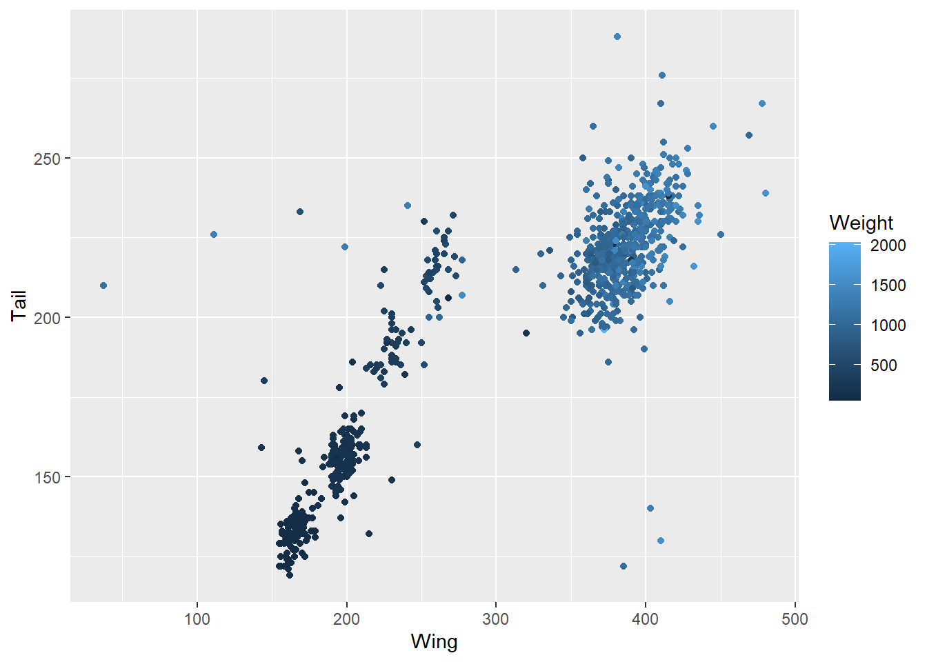
Those might both be a bit difficult to read, though, so you could also simplify matters by using a logical expression - which of these hawks is over 1.5kg?
ggplot(data = hawks, mapping = aes(x = Wing, y = Tail, colour = Weight > 1500)) +
  geom_point()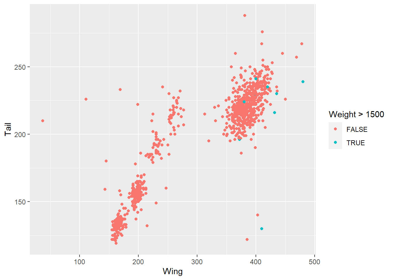
You can also use the facet_wrap() function to break a categorical variable into separate graphs. This might help pick out specific categories worth exploring further.
ggplot(data = hawks, mapping = aes(x = Wing, y = Tail, colour = Species)) +
  geom_point() +
  facet_wrap(~ Sex, nrow = 2)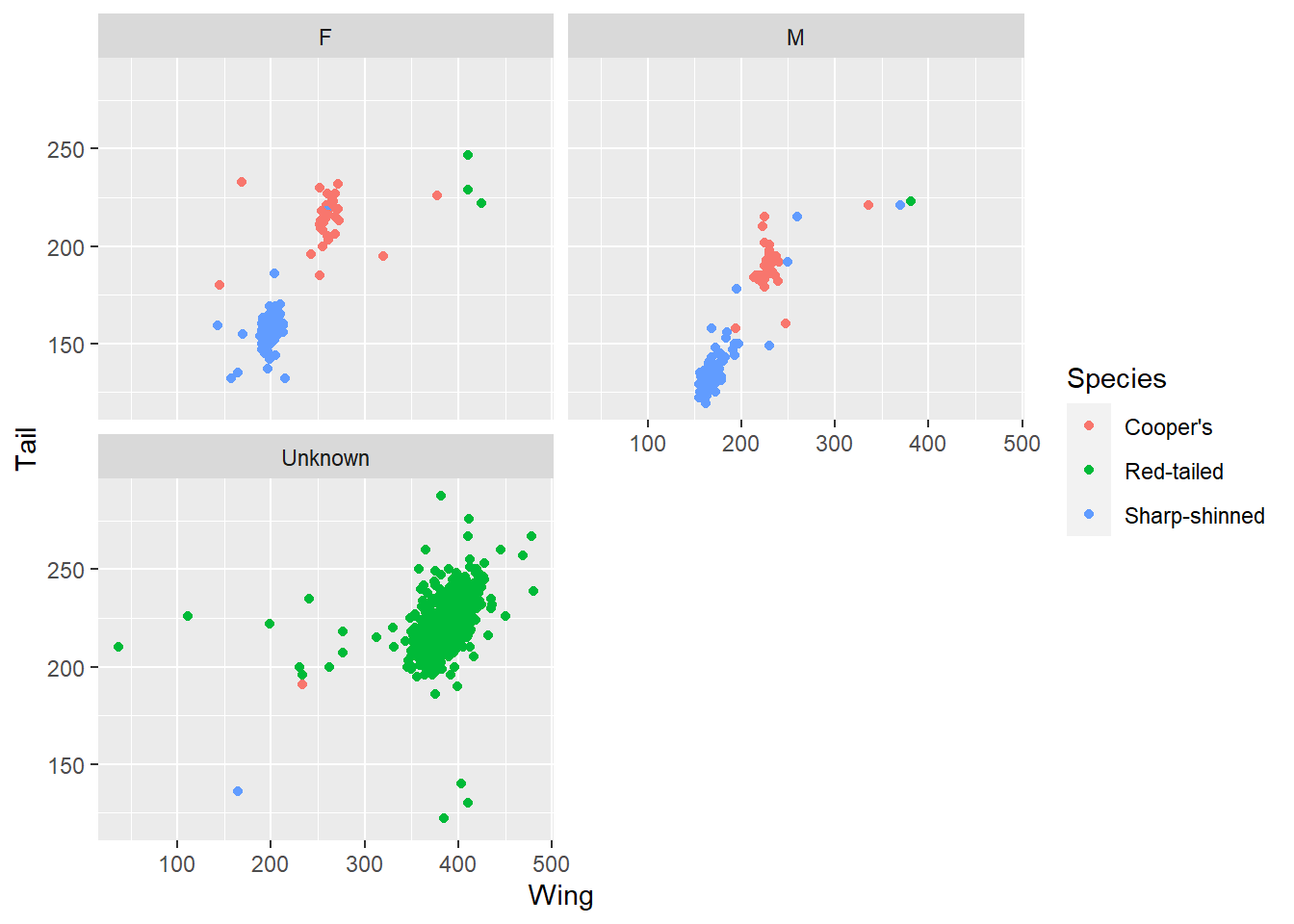
Here, for example, picking out sex produces three graphs, including one where sex is unknown. Interestingly these correspond to one of the species clusters, which might lead to some questions about the data. Is that hawk species harder to sex? Or was the data collected differently in different studies?
We’ve looked at bar charts and scatter plots. If you type ggplot2::geom_ into RStudio and start tabbing for suggestions, you’ll see there are tens of different chart types you can use. Here’s a histogram and a boxplot for additional examples. With geom_histogram(), the default number of bins is 30.
ggplot(data = hawks, mapping = aes(x = Sex, y = Tail)) +
  geom_boxplot()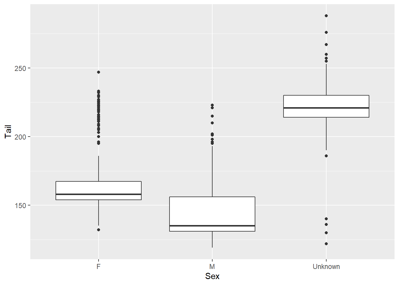
ggplot(data = hawks, mapping = aes(x = Wing)) +
  geom_histogram(bins = 15)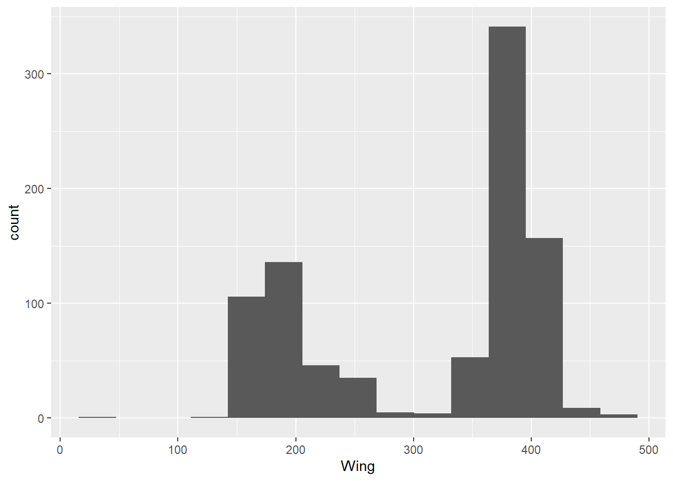
That’s an introduction to constructing a basic graph with ggplot2! You might think these colours could be improved, or wish the bars were in a different order on the bar chart, or feel there are too many gridlines - but don’t worry, we’ll look at adapting the look of these plots to your specification in the next post.
But I’ll leave you with some other very important visualisations - photos of the actual hawk species the dataset concerns.
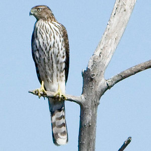 Cooper’s hawk, photo by Mike Baird
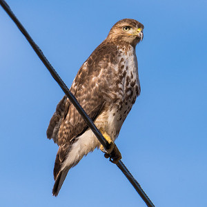 Red-tailed hawk, photo by Don Sniegowski
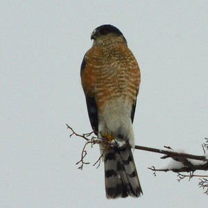 Sharp-shinned hawk, photo by Tod Petit