It’s the second day of January 2021, and a fitting time to be making resolutions. It’s also the time to look back at commitments made at the start of last year and check in on how they went. A lot of plans went awry in 2020, but staying home made it easier for me to stick to my resolution to eat less meat because I was doing a lot more meal planning. The result was I only ate meat on 35% of days, which was better than my original aspiration to cut it down to 50%.
This is super self-indulgent, and I apologise for that - but I did think it was quite a fun dataset to explore in more detail (for me, anyway). Because to keep track of what I was eating, I dedicated a page in my very underused bullet journal to the task, so I’ve got a log of whether each day was vegetarian, pescetarian or meat-eating. It looks like this:
The first thing I wanted to do was replicate that chart using ggplot2. I started off by transcribing the data into a spreadhseet with the same dimensions and info.
# Load libraries and fonts
library(data.table)
library(ggplot2)
extrafont::loadfonts(device="win")

# Read in data
food <- fread('food_diary.csv', header = TRUE)
food
## Month 1 2 3 4 5 6 7 8 9 10 11 12 13 14 15 16 17 18 19 20 21 22 23 24 25
## 1: January V P P P M V M M V P M V V V M V M P M V M P P M V
## 2: February M M M M V P M V M V V V V P M V M V V M P P M P M
## 3: March M M M V V P M V M M V P V P M V M P V V P M P M V
## 4: April V V V M M V V M V P M V P M M P V V M V V P M P V
## 5: May M M V V V V P M P P M M M V V V V V M V M P P M M
## 6: June V V M P P P V M V V M P P M V V P V M V M V V V V
## 7: July P P M V M P P P P P V M M M P V M V M V P M V V V
## 8: August M P V P P P M V M V V M M M M M P M V V M V M V V
## 9: September M V M M V P V P V M M M M P P P M M M V V V P P P
## 10: October V M V V P V P V M M P V V M P P M M V M P P V V M
## 11: November V M V M V P V M P P P M M M M V M P M V V M P M V
## 12: December P P V M M V V V P V M M M V P M P P V M V V M M M
## 26 27 28 29 30 31
## 1: V V P P P M
## 2: P V P P
## 3: M V P M V V
## 4: M V M M P
## 5: M V V P V M
## 6: M V V M P
## 7: M V P V V P
## 8: M V P M P V
## 9: M V V V M
## 10: P V M V V M
## 11: M V V M V
## 12: M V V P P MThen I adapted the data so it was a bit more user-friendly. I wanted one row per day, which will be useful for future analysis too.
# Transform data so one row per day
day_cols <- as.character(seq(1, 31))

food_by_day <- melt(food, id.vars = "Month", measure.vars = day_cols,
                    variable.name = "Day", value.name = "Diet")

food_by_day <- food_by_day[Diet != ""]
head(food_by_day)
## Month Day Diet
## 1: January 1 V
## 2: February 1 M
## 3: March 1 M
## 4: April 1 V
## 5: May 1 M
## 6: June 1 VAnd here’s my attempt to roughly replicate the page from my journal.
# Months in correct order in factor
food_by_day[, Month := factor(Month, levels = unique(Month))]


# Colours for plot
diet_cols <- c("orange", "dodgerblue3", "limegreen")

# Plot
ggplot(food_by_day, aes(Day, Month, colour = Diet)) +
  geom_point(size = 2) +
  theme(
    plot.background = element_rect(fill = "snow1"),
    legend.background = element_rect(fill = "snow1"),
    panel.background = element_rect(fill = "snow1"),
    text = element_text(colour = "seagreen4", family = "Corbel Light",
                        size = 16, face = "bold"),
    axis.text = element_text(colour = "deeppink4",
                             family = "Ink Free", size = 8, face = "plain"),
    axis.title = element_blank(),
    panel.grid.major = element_line(colour = "gray80",
                                      size = 0.1,
                                      linetype = "dotted"),
    plot.title = element_text(size = 30, hjust = 0.5,
                              margin=margin(0,0,15,0)),
    axis.ticks = element_blank(),
    legend.key = element_rect(fill = "snow1")
  ) +
  scale_y_discrete(limits = rev(levels(food_by_day$Month))) +
  scale_x_discrete(position = "top") +
  scale_color_manual(values = diet_cols, labels = c("Meat",
                                                    "Pescetarian",
                                                    "Vegetarian")) +
  labs(title = "EAT LESS MEAT TRACKER 2020")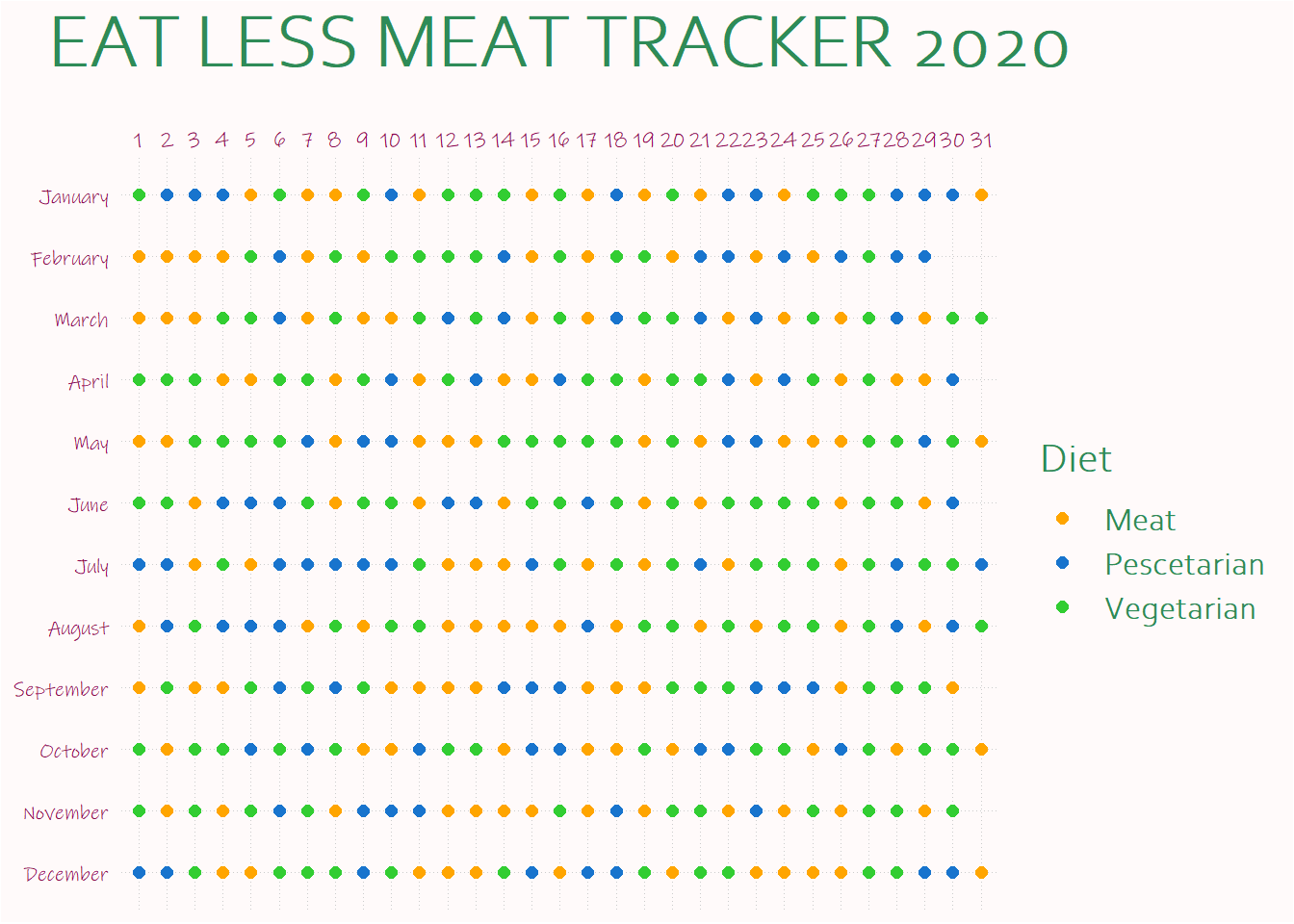
Next, I’m going to do some data exploration and try to find out if there are any interesting patterns - particularly if they help me do better this year.